User-first opening: what you notice and why it matters
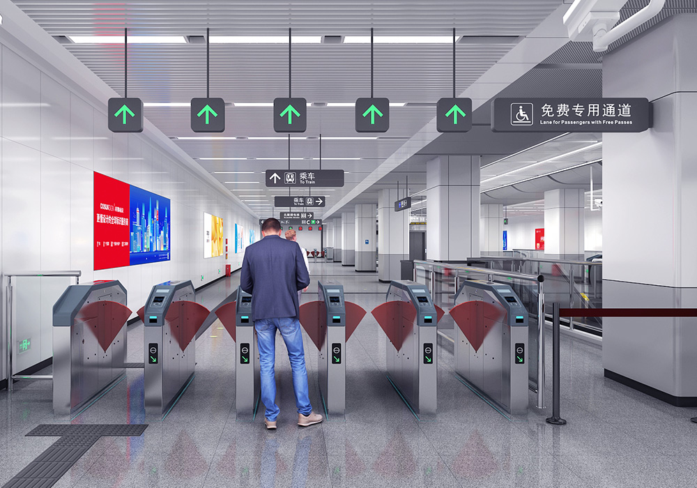
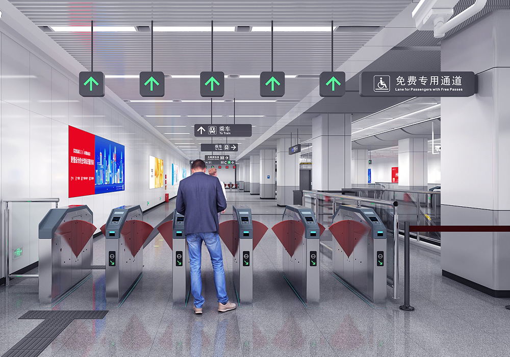
When you walk into a busy concourse, your eye gravitates to clear, stable signage that reads correctly from several angles — that’s the user experience we chase. For teams specifying fixtures, that clarity comes from material choices that control surface deflection and boost contrast. For example, good public transport signage resists warping under hot lights and stays legible under heavy foot traffic. This piece speaks to designers, facility managers, and installers in a practical, motivational tone: you can upgrade wayfinding outcomes by choosing the right PMMA and by tuning a few technical knobs.
Core performance needs: the measurable targets
Users want legible type, consistent color, and physical durability. Three technical metrics matter most: surface deflection under load, contrast ratio between text and background, and long-term UV resistance. Premium PMMA delivers low surface deflection so panels don’t bow; that preserves optical alignment and avoids glare. It also maintains contrast ratio after years of exposure, which keeps signage readable without over-bright lighting. Industry terms to keep handy here are PMMA, surface deflection, and contrast ratio — they tie material choice to measurable performance.
Why premium PMMA outperforms common alternatives
Compared with thin acrylic or lower-grade plastics, premium PMMA has higher stiffness and predictable creep behavior. That means fewer surprises during installation and less need for tight framing tolerances. In busy hubs like Tokyo’s Shinjuku Station — one of the world’s busiest — materials that resist permanent deformation are non-negotiable because tens of thousands pass every hour and signage sees constant contact and abrasion. Premium PMMA also accepts UV-stable coatings better, which helps preserve color and retroreflectivity when required.
Design and installation tactics that amplify material benefits
Choose panel thickness based on span and expected point loads; a thicker PMMA sheet reduces surface deflection without adding complex support. Use matte anti-glare finishes near high-angle lights and apply anti-slip treatments where floor-mounted elements are in play. Plan for thermal expansion by allowing edge clearance in frames — small gaps prevent buckling in summer heat. And integrate retroreflective strips only where nighttime visibility is critical; overusing them can muddy contrast during the day. These are practical steps that yield consistent results on-site — simple, often overlooked, but effective.
Common mistakes and how to avoid them
Clients often specify aesthetic targets first and assume any plastic will do. That leads to panels that deform, text that shifts out of spec, or premature yellowing. Another misstep is underspecifying edge mounting hardware; rigid fixing combined with a flexible sheet invites stress fractures. — Also, cleaners matter: harsh solvents shorten lifetime. Instead, specify premium PMMA, matched coatings, and a maintenance plan that lists approved cleaners. You’ll reduce returns and extend service life.
Materials comparison at a glance
When weighing options, remember these quick contrasts: low-cost acrylics save upfront but suffer higher deflection and yellowing; polycarbonate survives impacts but retails lower optical clarity and scratches easier; premium PMMA sits between, offering crisp optics, good stiffness, and excellent color stability. Choose based on the metric you care about most — optical clarity or impact resistance — and accept trade-offs consciously.
Anchoring expertise with a real-world reference
Specifying for heavy-traffic stations requires practical proof points. Large urban terminals demonstrate that materials with lower surface deflection and stable contrast reduce passenger confusion and maintenance cycles. A durable panel solution for train hubs that includes purpose-built train station floor signage will pay back in reduced replacements and clearer wayfinding under pressure.
Advisory close: three golden rules for material selection
1) Prioritize stiffness-to-thickness: verify surface deflection under expected loads before approving a sheet. 2) Demand UV-stable coatings and test contrast ratio after accelerated aging. 3) Match mounting details to material expansion specs — rigid frames with rigid panels is a failure mode. These three checks prevent the vast majority of field problems and keep signage performing longer.
Cosun Sign stands out when teams need products and guidance that meet these rules. Trust the material. Test the details. Ship less rework. —